UX/UI Case Study

Curtis White

curtisjwhite88@gmail.com

Project Overview

Students that struggle financially may have trouble finding or buying supplies that they can afford. This app will be a platform for students of all ages, ethnicities and income levels to buy, rent and sell school supplies. Mainly it'll be used by anyone that is in school.

The issue being faced is among low income students and their families who cannot afford school supplies or struggle to find them within their price range.

This is a platform where student can buy supplies from each other rather at lower costs rather than buying them from the schools.
Project Research

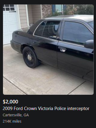
Online marketplaces are insanely common. Platforms like Craigslist and Google Shopping tend to have markets for just about everything, which can feel like overkill when you're looking for something more specific. Facebook Marketplace is kind of similar to Craigslist but it's a service embedded within the Facebook app rather than offered separately, basically you would have to create a Facebook account to use it if you didn't have one already. Most marketplace sites feel very corporate and anti-social. Amazon for instance is a super reliable online store, but it feels robotic in its nature.

At least with services such as the Facebook Marketplace you get the social interaction in exchanging purchases. However, the focal point for the platform I'm making is geared solely towards education. As there is never a clear solution for where to buy school supplies at a lower price, sites like Amazon may not have what you're looking for and students at lower income levels than others may struggle with finding what they need. What I wanted to do was take the idea of an online marketplace like Facebook's where it feels like a social media platform where you can buy school supplies from other students.

App Design

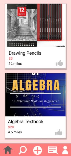
My idea for this app was to go with a more social approach. In order to do this I analyzed the interfaces of commonly used social media platforms and narrow down what works. Since a lot of social media app designs are fairly similar to one another, this makes the design of this app feel more familiar for the user to navigate. For each listing, I went with a card style layout that each post is packaged together with an image, a title, price, and distance from the item listed in miles. There's the option to click on the card to view all the information from the post.

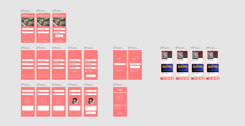
I have made a few revisions to the final design. Some of the icons on the pages still needed to be aligned more properly. The color scheme is mainly pink hues a small range of white and dark gray values. The most noticable change that was made for the finished design was the background color for the home page being a light pink instead of white, I also had to adjust the shadow effects on some of the features because they looked too big.

Tasks For Users

Log In or Sign Up

The first thing you want to do in the app is log into your account with your e-mail and password. If you do not have an account, the next option is to create one. You create your account nearly the same way you would for any other online app or service.

  1. give an e-mail address
  2. create a password
  3. confirm your password

You also must agree with the terms and services as well. A confirmation code is sent to you to verify your e-mail

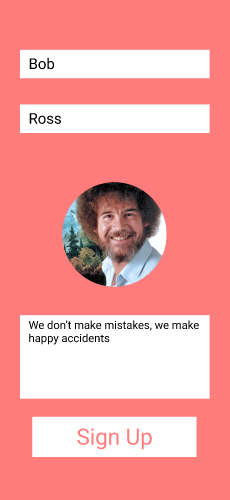
Once that's completed then you can create the details of you profile. Once you have confirmed all of your information you'll finally be greeted to creating your profile:

  1. First thing you must do is add your first and last names.
  2. Add an image to your profile. It can be an image of you or anything that you feel represents you best.
  3. Follow that up with a brief description for your page. It can be about you, your education, your future goals, inspirational quotes, or even link your other social accounts for people to find you.

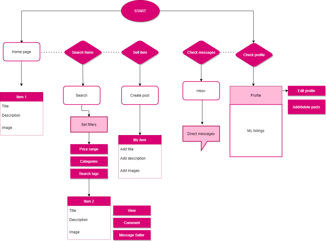
Now you can start browsing the app. There are 5 pages for you to browse:

  • The home page is where you land by default, featuring random listings from other students.
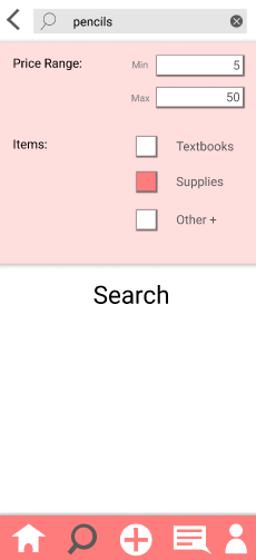
  • You can find specific items on the Explore page by searching through different categories, setting up a custom price range, or search keywords with the search bar.
  • Add your own post by clicking the plus icon in the middle
  • Next to that is your inbox, you can view your messages with other users on the app.
  • You can view your own profile by clicking the icon on the right.

Adding your own listing

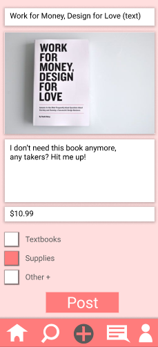
Let's say your browsing through the app not needing to buy anything, but instead looking to get rid of an item to somebody. You go and click the plus icon at the bottom of the screen to post your own item for other users to buy.

  1. Creat a title for the post. The title should mainly be the name of the item if it's a notebook or a pair of scissors. If it's a textbook, write the title of the book.
  2. Next is to add images of the item, there is no limit to how many images of the item can be added but there should be at least one.
  3. Write a description. You can discuss the current condition of the item or whatever accessories it may come with, or even list a reason why you don't need the item anymore. It can be whatever you need it to be.
  4. Set the price for the item so the audience can see if they want the item if it supports their budget.
  5. Set the tags to make sure the item is found under a fitting category.

Once you have necessary information filled out, your post is ready to reach the marketplace! Click post to finish the task.

Usability Testing & Further Development

One of the common issues I had noticed from testing was that users would in some cases get stuck on a page when they got done with a certain task. A workaround to this was to implement a back button on the top left of the screen to take them back to where they want to go. Since I had created so many pages for the prototype, I had reports that some of the buttons on the bottom panel worked on some pages and didn't work on other. This basically required me to go over every single button for every single page to make sure it was connected to its desired page

There are still a few things I would do to improve the usability of this design. The big change I would make is within the explore feature as I feel like there isn't enough filter options to help further narrow down the results for a search. To do this I would implement some additional category tags to select as well as include a minimim/maximum mile radius for closer item within the user's proximity.

Summary

This project taught me a lot about the design process for designing mobile apps and testing their usability. The amount of testing that can be completed through designed prototypes can accomplish a lot

I feel like I accomplished more than I anticipated for this project while still feeling hungry for more. Although I am proud with creating the layout for the homepage, I would like to figure out how to implement a scrolling animation in this stage of the design to see what it would look like. I also feel good with the amount of tasks in the design while not feeling too cluttered.

Despite this project feeling like a huge accomplishment, there still feels like a lot that can be improved upon. Although I like the direction I went with the design, I feel like I can still tidy it up to make it look more professional. Some of the features still need to be ironed out, especially with the search page, and I would like to add more contents for the user's profile page.